Along with Stephen Hackett, MacStories and six colors I too have reviewed the Apple Watch faces and think the Modular face as the closest to what I want but with the same desire that the option be available for local time to be in the middle complication so it is more prominent and larger. It was also announced that third parties will be able to include complications for supplementing Apple watch faces but I hope Apple will introduce a new and improved Modular watch face to be a better template with more choices. The easiest solution is just to allow local time to be included in the middle complication. This would be a better choice than the current choices of the current day and date, the time and name of your next calendar event, detailed textual moon phase or sunrise/sunset data, current weather, stocks, activity, alarm, timer, stopwatch, and world clock. None of of the current choices do I want to be the most prominently displayed information.
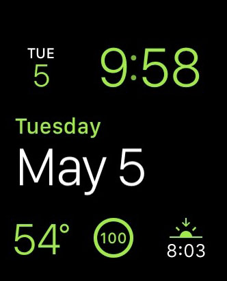
Apple Watch Modular Face with Date prominently displayed in the middle complication area.
Stephen Hackett on Apple Watch Faces:
I’ve been wearing my Apple Watch for a couple of weeks, and while I’m still churning on my review, I wanted to share my thoughts on the ten watch faces that come with the device. While having so many options is great, many of the faces have frustrating limitations in the ways they can be customized or used.
Stephen Hackett has a nice rundown of the watch faces included in Watch OS 1.0. I’m still experimenting with my Apple Watch Sport (which I received a few days ago) and playing around with watch faces and complications.
Here’s Stephen’s take on the Modular face:
On the face of it (sigh), Modular seems like a huge winner. Why take up space faking being a real timepiece when the watch is digital?
Pros: Big, easy-to-read text with lots of flexibility.
Cons: The time is locked to the upper-right corner; I’d love to have it be the biggest thing on the Watch face. Having three complications across the bottom is nice, but can feel a bit cramped.
While I can read an analog watch, it still takes me a second of parsing, and I don’t want that on a device I’m supposed to quickly look at every day. Even if small, the cognitive load required to understand time on an analog face adds up over time, and, more importantly, I need a watch to show me the precise time (down to the minute) for work purposes.
That said, I do wish that Apple offered more personalization for the position of complications on the Modular face. It’d be nice to have time in the middle of the watch face and a smaller calendar complication in the upper right corner.
(Via MacStories)